
Improving the Digital Experience of Student Housing at the University of Guelph
My Role
Design Lead
I led end-to-end redesign and migration of the website
Team
1 PM, 2 Engineers, 1 Designer
Timeline
2024 Q2-Q3
Skills
Research, Interaction Design, Product Thinking
Short on time? I got you covered.
Here's a 1 min TL;DR version
What did I do?
Led the redesign and migration of Student Housing website for the University of Guelph.
The impact I made?
Driving a 27% decrease in bounce rate, 35% drop in call inquires, and 22% reduction in email inquiries.
What did I learn from this?
Managing different stakeholder priorities, navigating time and resource constraints effectively. Gained experience in securing buy-in from engineers.
The problem
Since 2021, On-Campus Housing demand at University of Guelph jumped by 30%
The Housing website was last updated in 2012 and failed to support the universities growing needs, creating friction for users and operational inefficiencies for staff.
32% Increase in call and email inquires

2+ hours time spent daily answering questions

Costing $12,000 yearly pulling staff from critical tasks

Identifying Stakeholder Goals
Interviewing 5 key stakeholders, surveying 20 campus partners
Conducted 5, 1-1 interviews with internal leadership to gain a deep understanding of: high-level goals, resources, timeline, competitors, key metrics
Gathered 70 survey responses from other campus partners like admissions, colleges to get feedback and build early relationship
What success looks like for stakeholders?
Internal Stakeholders

1. Housing site should align with the university's official Admissions site
2. Staff should spend no more than 1 hour per day responding to inquiries via email and phone
3. Reduce repeat questions about residence features by 30%
What campus partners are saying?
External Stakeholders

Identifying User Goals
We looked at user behavior & made hypothesis
Constraint #1
With limited access to user feedback, our only option was to rely on current website analytics to find patterns in user behavior
/
01
Identifying user types through content engagement
Primary users
75% visitors on our site are Future residents
25% visitors are current residents
Secondary users
The frontline housing staff who answer inquiries from parents and students via calls and emails

/
02
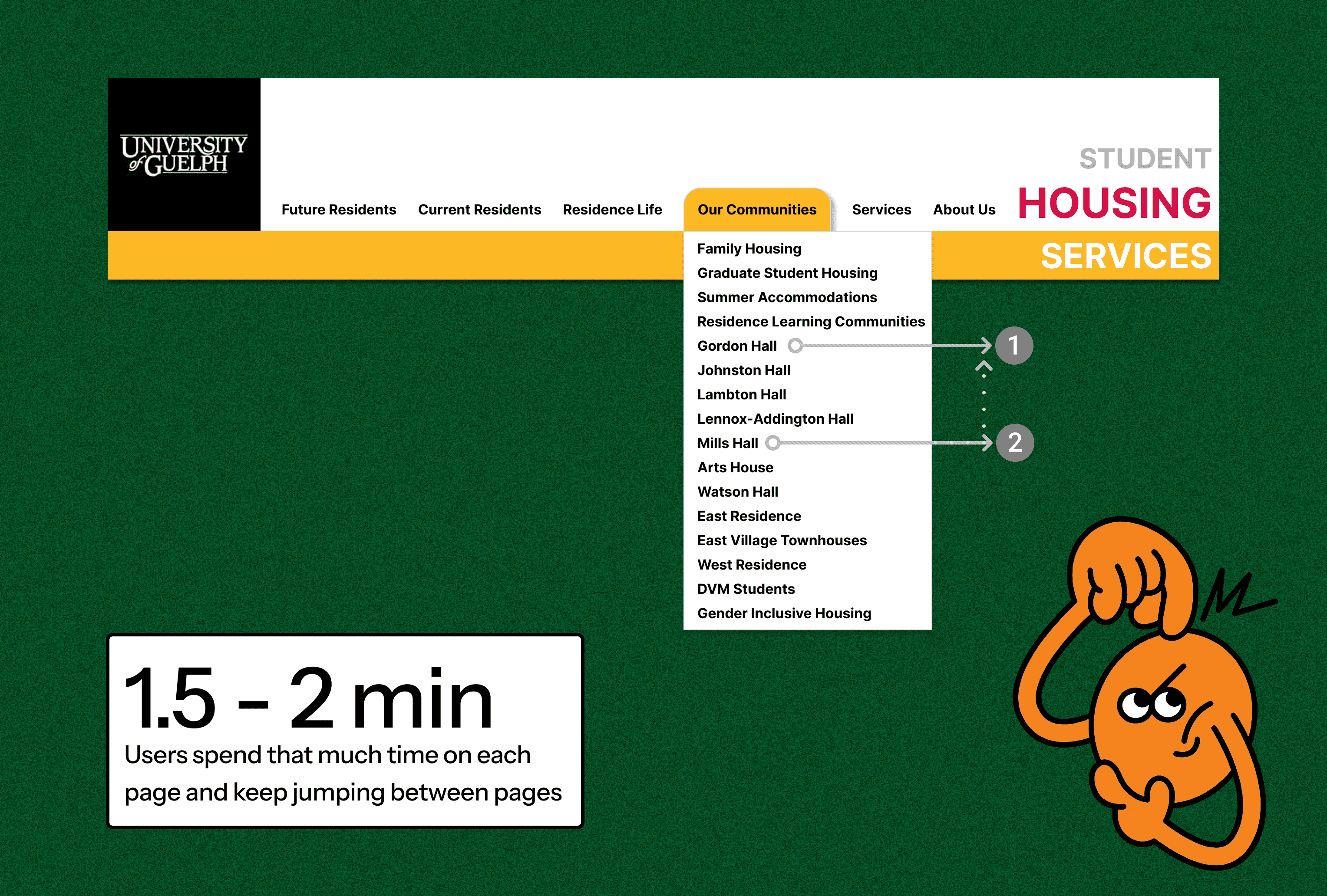
Users spend 1.5 - 2 min on a page and keep jumping between pages
User Behavior
Selects a residence from the top navigation
Scans the page for 1.5–2 minutes
Chooses another residence from the menu
Repeats the scan for 1.5–2 minutes
Navigates back to the previous residence
Hypothesis
Users are scanning multiple residence pages to gather key information, possibly for comparison or shortlisting
/
03
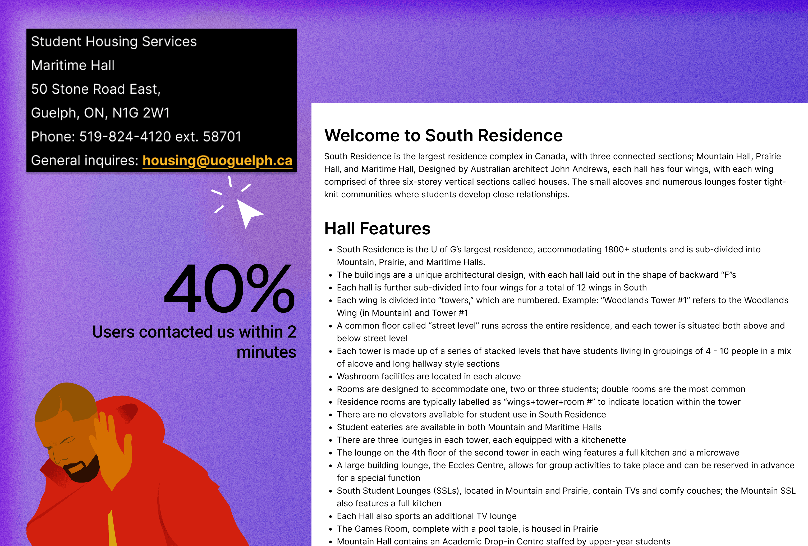
40% of users contacted us within 2 minutes
User Behavior
Users hardly stayed on the page and decided to click on contact information
Hypothesis
Possibility #1: Users are not able to find exactly what they are looking for
Possibility #2: Users didn't read the information at all because of content overload
User Testing
Validating our hypothesis to understand key user problems
We focused on testing one hypothesis, as both user behaviors pointed to the same underlying issue. By exploring one, we were also able to uncover insights that helped explain the other.
What user testing revealed
Users weren’t deliberately comparing residence buildings - they were confused, overwhelmed, scanning for basic info.
They were scanning and leaving because info was hidden, inconsistent, or too text-heavy.
Key Takeaway:
We found that users were stuck at the “understanding” stage.
They didn’t even get to true comparison because the content was unclear, inconsistent, or buried.

Ideation + Design Decisions

"I’m a new student - I don’t know which residence to click on. The building names don’t tell me anything"

User Decision Making - Level 1
We chose Option 2: By Study Level because it requires the least cognitive effort for users.
Since students typically apply for residence after applying to their academic program, organizing communities by study level aligns directly with how they already think about their university journey.

User Decision Making - Level 2
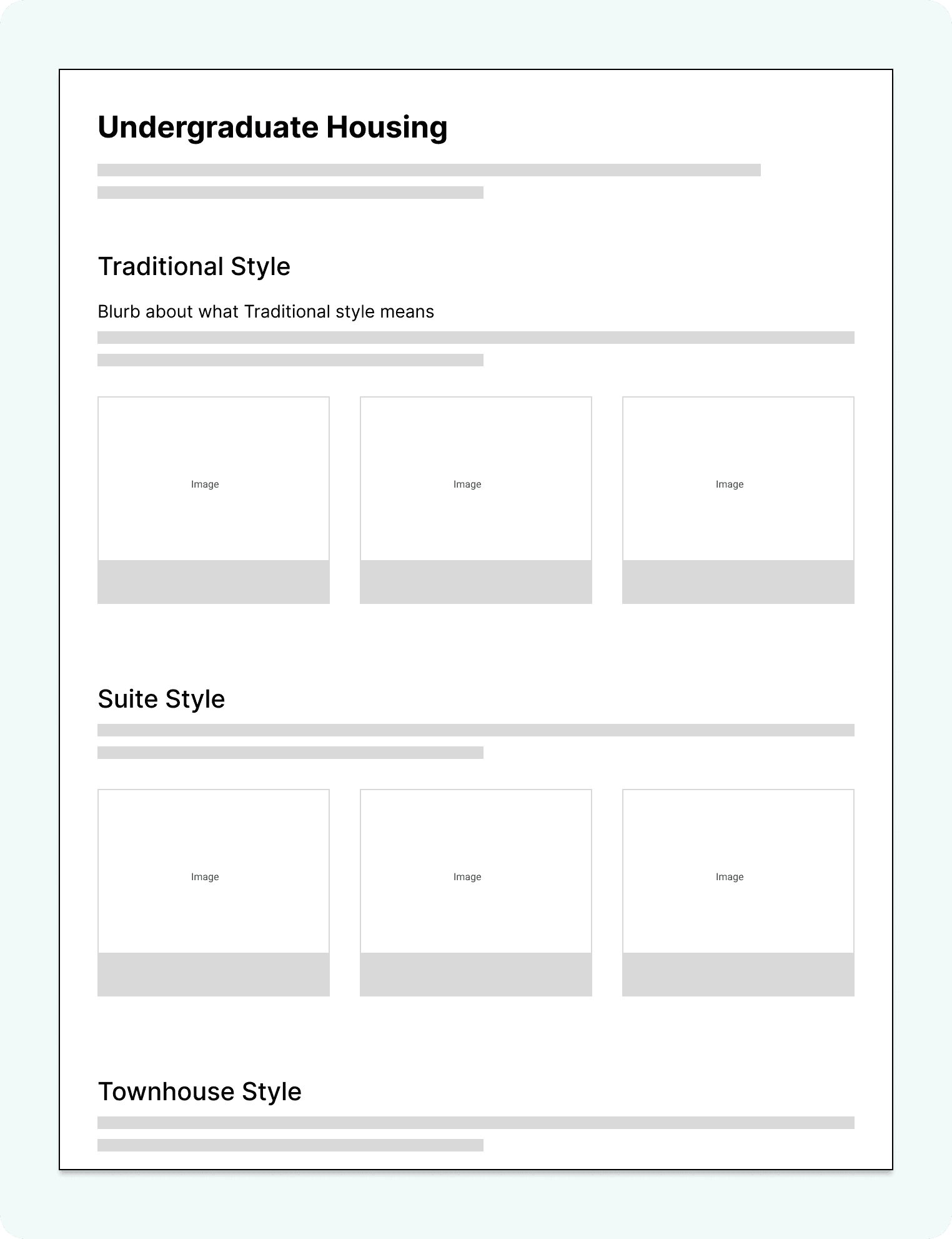
We chose Option 2: By Style because it better reflects the decision-making criteria students actually care about when choosing where to live.
“Do I want a private bathroom?”
“Do I want to live in a shared space or have more independence?”

"Next, I’m trying to figure out which residence is the best fit for me"
Option 1
Providing a clear overview of residence offerings grouped by style, paired with a short blurb explaining each style type.
Option 2
Left Sidebar with Filters
Giving a tool and making things more dynamic to help students find the best residence for them based on their preferences.

Constraint #2
We chose Option 1 due to component constraints from the development team. Although the Option 2 - custom filters was our preferred choice, we faced feasibility and timeline limitations that made it difficult to implement.
"Now I want to shortlist residences based on my preferences and needs"
Option 1
List view of amenities

Option 2
Categorizing amenities

So far, here's what we fixed for the user :)

Discover
Understand
Shortlist
Compare
Reflection
Do users still need a comparison tool?
After simplifying discovery, understanding, and shortlisting, we paused on the comparison feature:
This was a key moment where we decided to test if users truly needed this feature or if new pain points had surfaced instead.
User Testing
Pivoting based on User Feedback
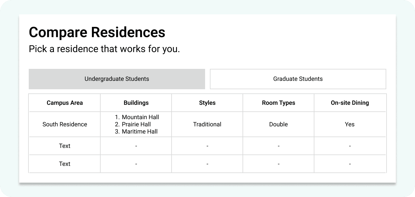
“I had to open multiple tabs to compare residences"
✅ What was working?
Students found it easy to understand the details of each residence once they landed on a residence info page.
❌ What was not working?
There was no built-in way to easily shortlist or compare side-by-side, which slowed down the decision-making process.
Option 1
Comparison Table
Option 2
Showing residences with similar amenities

Final Designs & Metrics