UX Strategy, Research, Design
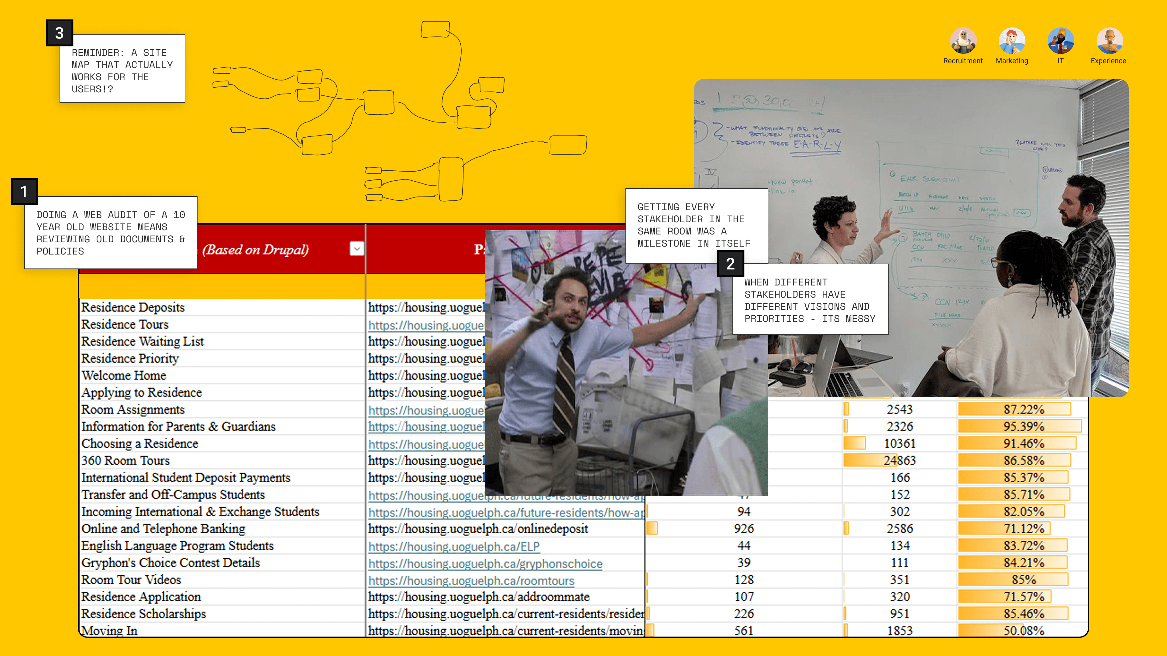
2024

The University of Guelph’s housing demand jumped by 20%. Their outdated website made it hard for students to find key information and even harder for staff to manage inquiries.


I interviewed 5 stakeholders and surveyed 70 campus partners
Conducted 5 interviews with internal stakeholders and 70 surveys with external stakeholders

User Insights
After analyzing data of 150 pages we made 3 hypothesis
Enough with data.
I interviewed 3 students to validate these findings.
"I'm looking for a space where I could see myself every day"

We tested the current site with 3 students
Explore a Residence building on the current website to observe what confused them and the steps they would take to choose where to live.
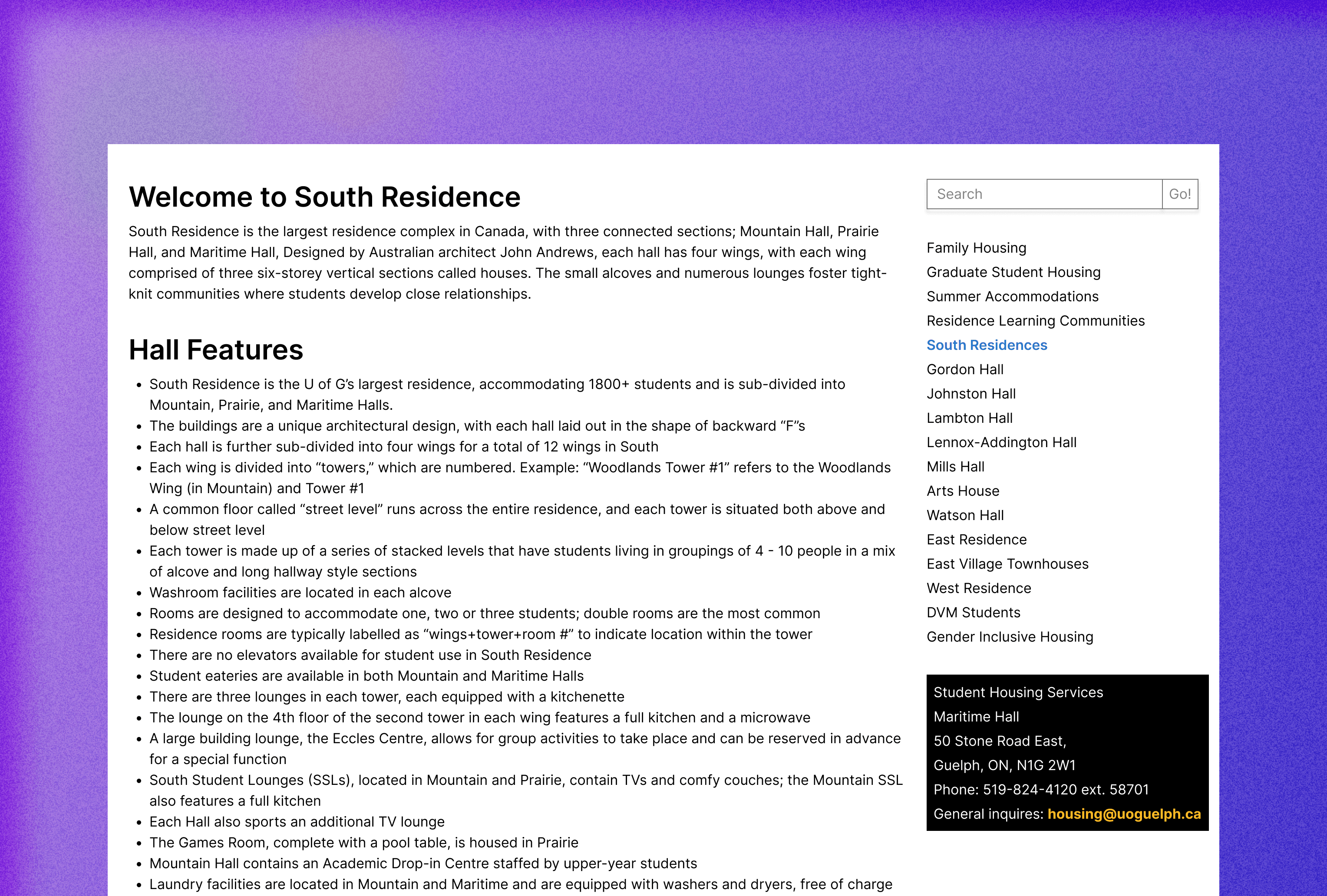
Can you find out if there's a kitchen included in South Residence?
What we heard?
“Is it in every tower?”
“Is it shared?”
“Is it on my floor?”


THE
VISION
Transform the housing website from a maze of content into a clear, supportive guide that helps students feel at home before they even move in.
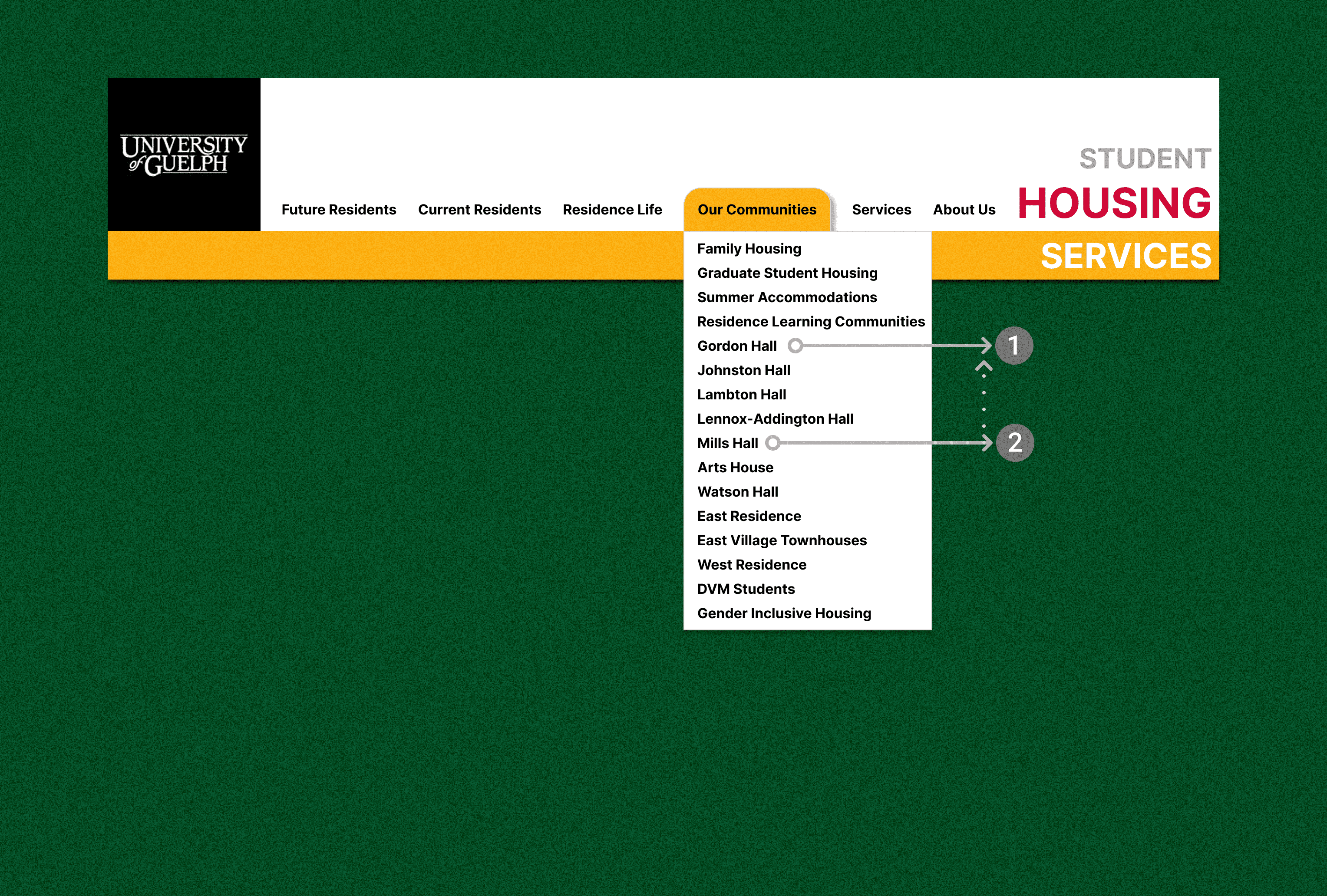
150 - 50
The journey from streamlining 150 to 50 pages
Identify gaps, discrepancies, and outdated content before jumping into any design changes.
Focus on the user and all else will follow
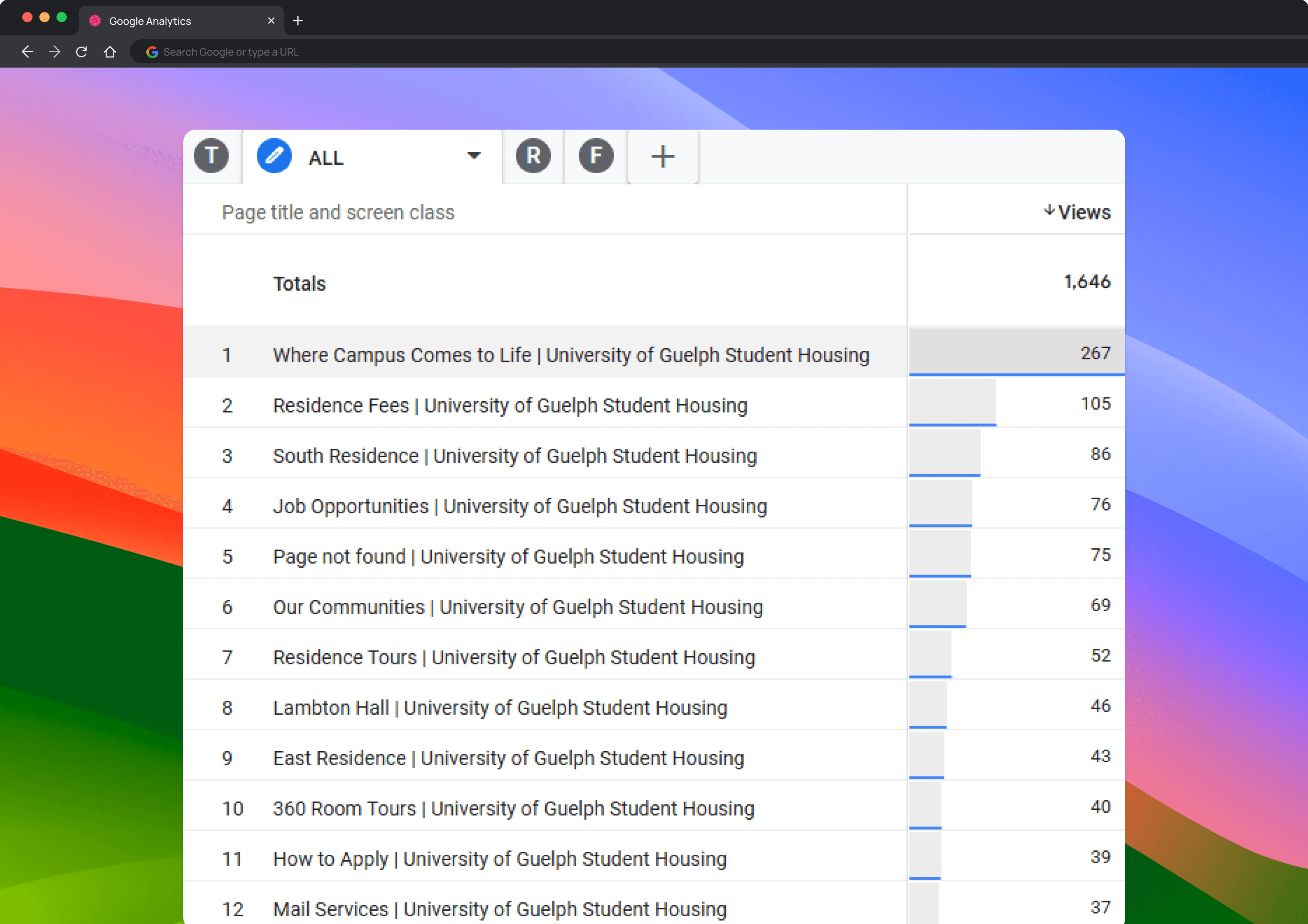
Which pages are getting the most traffic and the most confusion?

According to data insights - Residence pages with features and amenities are the most visited

Residence pages with features and amenities are the heart and soul of the website
I invited our engineers, stakeholders and the other designer to brainstorm solutions together. I encouraged them to come up with as many ideas as possible without considering feasibility at this stage.
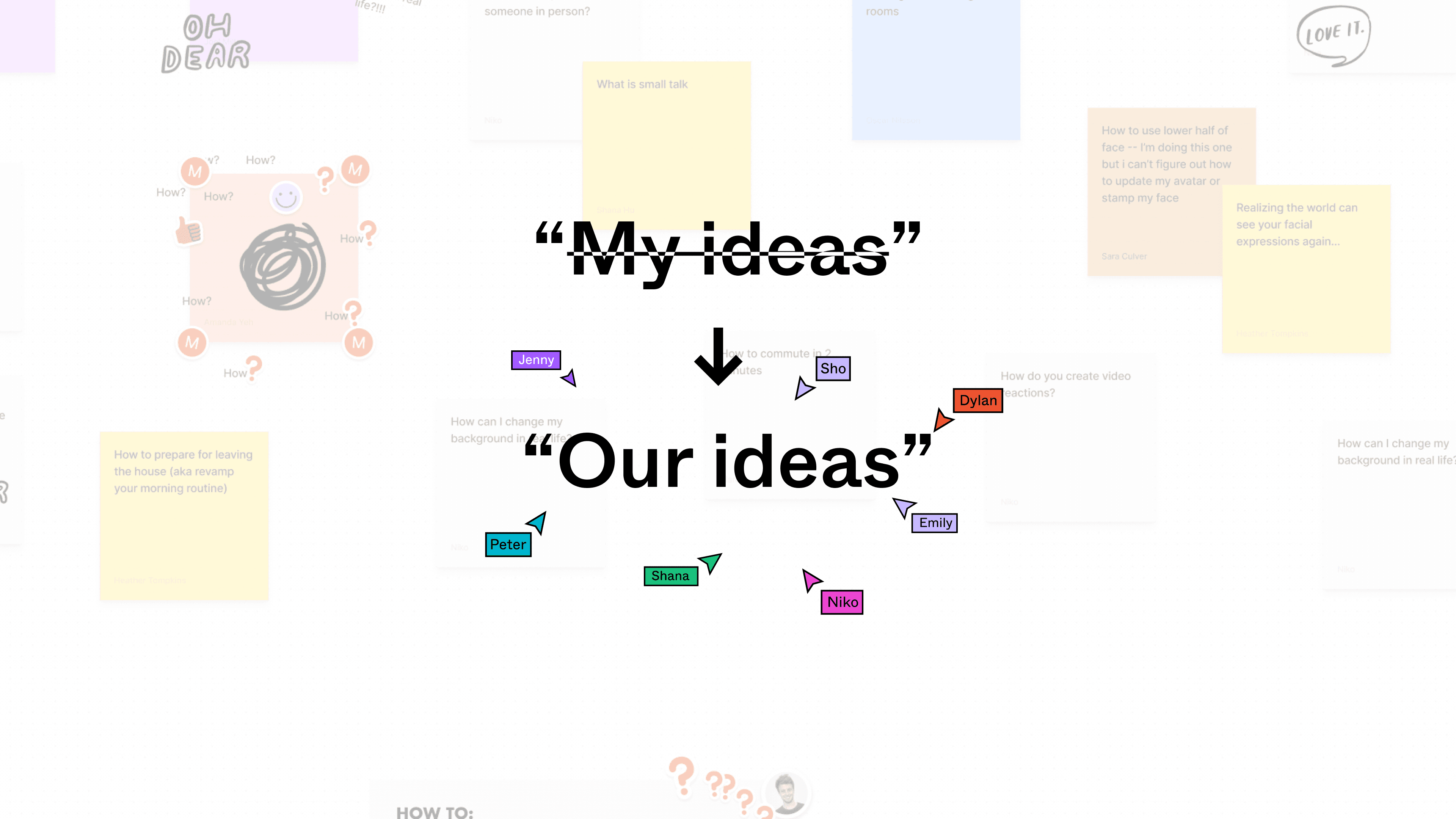

Bucket of Ideas
Top 3 selected ideas
We then went through the ideas and discussed their implementation feasibility. Eventually, we settled on the following core functionalities:

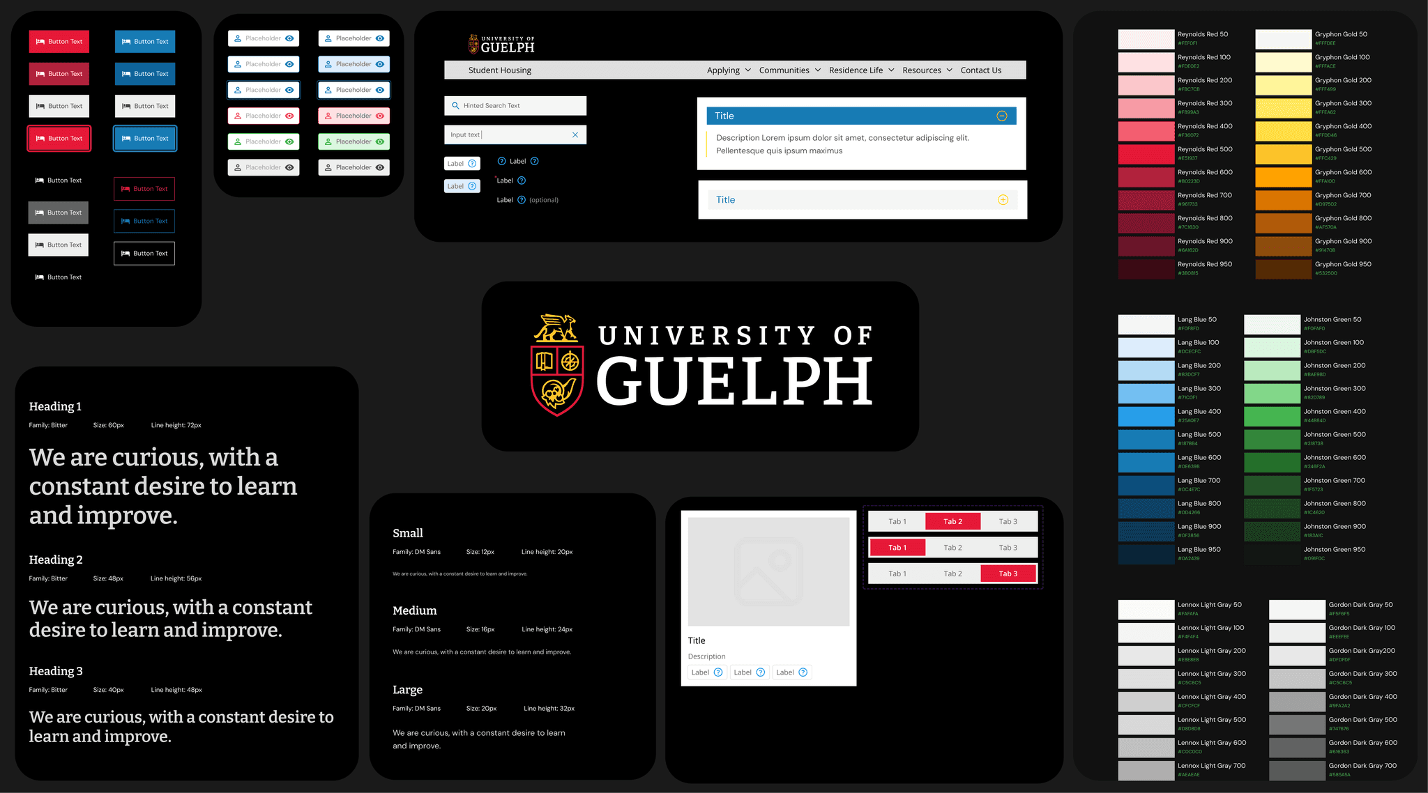
There is no library for dynamic components. So I established a design system
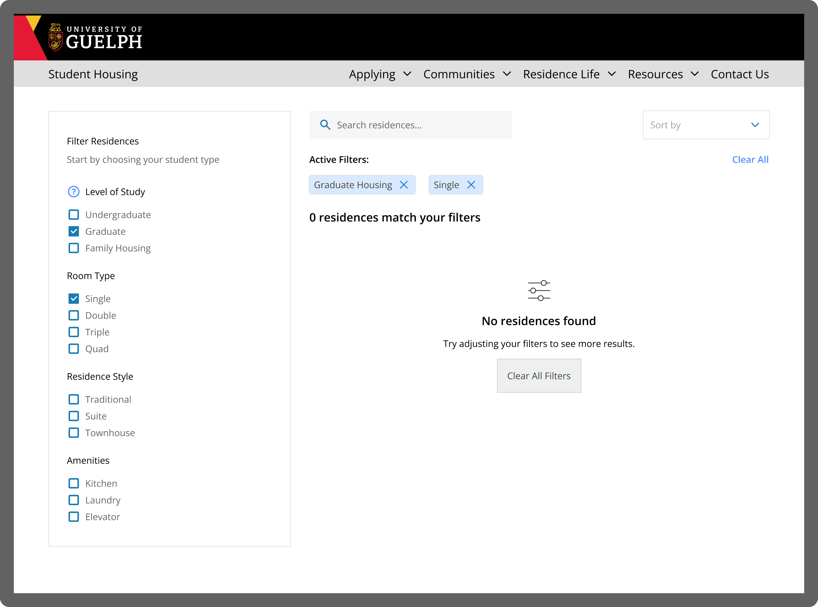
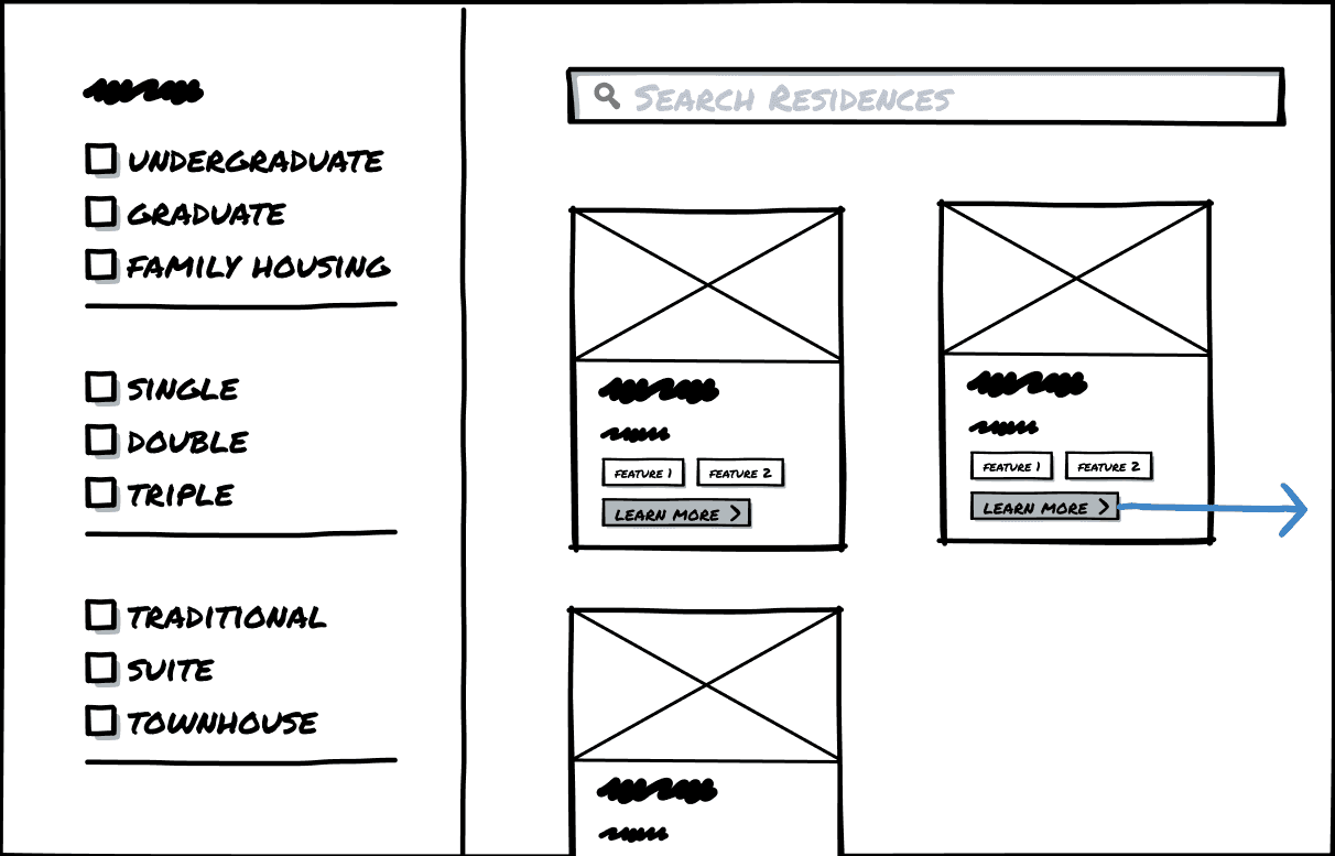
Why did we introduce filtering to address these issues?
Because even with just 13 options, the variables create dozens of combinations. Students ask very specific questions: "Is the bed big enough?", "Is the bathroom shared?", "How far is it from dining?"
Filtering will quickly help them to find their preferred choice.


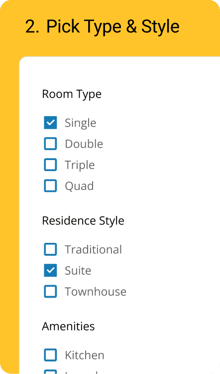

Why these Filters selected for 1st MVP?
Student level: Different buildings are allocated to different student types
Residence Style (Traditional, Townhouse, Suite): Major student pain point: understanding what the building actually feels like.
Room Type (Single, Double, Triple: Students are trying to budget
Amenities: Our staff gets lots of questions around clarity and what's available in which building
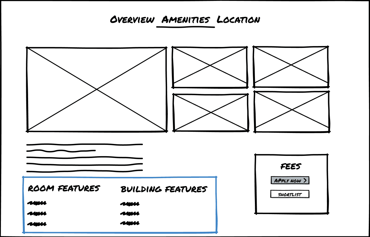
I broke down complexity with visual cues
Card Layouts make it easier to scan and compare residences
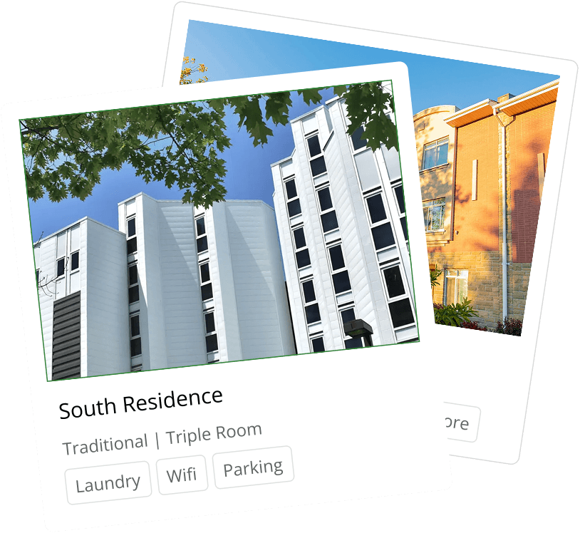
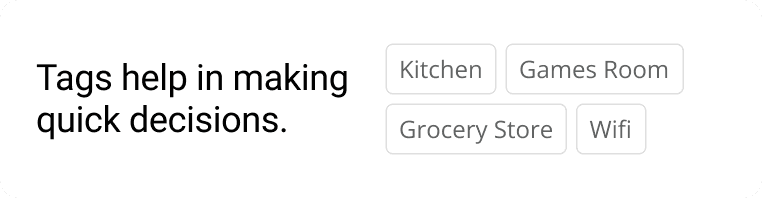
Tags for quick glance of amenities
Switched to “Best Fit” matching instead of Strict Filtering
Users hit dead-ends and got frustrated with “No results”
Upon testing with users, we realized they got frustrated when they quickly reached dead ends after filtering for specific preferences and not finding any results.